
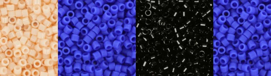
Everyone has some experience with this; that you have chosen beautiful colors for your new project, but after several rows of stringing you realize that this combination does not work out very well … In the blog below we give the first bit of guidance by showing what a number of color combinations can do with each other.
Which colors should you choose in your project and what effect will this have? When it comes to combining colors with each other, the following factors influence at least:
Light / dark.
Matt / Glossy.
Type of color (for example red, blue or yellow shades).
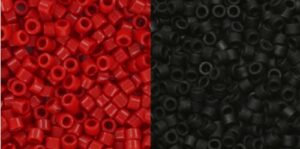
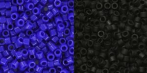
Below you see 3 combinations of photos. Take a look at them and decide for yourself which of the two right photos are darker. It helps to keep a long focus and stare a little, rather then really compare the photos.
Light / Dark:
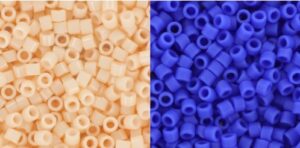

Above you see that the blue DB-1588 next to the light color pink DB-1492 seems fuller and more blue. In addition to DB-10, it becomes softer, almost more dull. A dark color will therefore make his lighter neighbor appear slightly lighter, thus increasing the contrast. If you want to make a color pop out, then you choose a light color next to it.
Mat / Shiny:
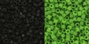
The green DB-724 looks somewhat darker and more matted next to the matt black DB-310. In addition to the glossy DB-10, the gloss of the green DB-724 is more visible and the color even seems a bit lighter. With this kind of combinations, the shine reinforces each other nicely. Be careful, too much glare and shine does not work either. A good example of this is the circumference of Swarovski elements. When you wrap it with matte (contrast) colors, the brilliance of the Swarovski wil pop out. If you use high-gloss beads, you will see that the colors start to overlap.
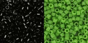
Colortype:
When you combine certain brighter colors, this certainly has an effect on the adjacent color. The combinations here are too endless to give an overview of, but the above combination is a good example. The matt black DB-310 looks deeper black next to the red DB-723 than it does next to the blue DB-726, where it looks more gray and duller. However, when it comes to color types, there is no easy guideline. After all, aqua and denim each have a completely different effect on the color next to it, but with comparing and trying you will become more and more experienced in this.
Just to be sure: the photos of the same color are exactly the same and we have not changed anything. The difference is minimal. If you do not see a difference now, it can help by looking at the photos somewhat staring. Remember that it can not be a big difference with these photos, but that the effect in a whole bracelet or necklace is clearer.
Try it out. A useful tip is to place the beads that you have on the eye side by side on your bead. Put one half in one color and the other half in a second color, so you can see what the effect will look like before you start. We are curious about your experiences!
For whatever reason only the photo at the title is visible. I open the page in two different browsers with the same result, the photos aren’t visible. I didn’t have that problem with other publications.
Hello Alicia,
Thank you for letting us know! The problem is solved 🙂